A histogram is a graphical representation of the distribution of numerical data. It’s useful for:
Visualizing Frequency Distribution: It shows how data is distributed over a range of values, displaying the frequency of data points within specific intervals (called bins).
Identifying Patterns: Histograms help in spotting patterns such as normal distribution, skewness (left or right), or multimodal distributions (having more than one peak).
Comparing Data: Histograms make it easy to compare the distribution of different datasets, especially when analyzing large volumes of data.
In this tutorial, we demonstrate how to create a histogram using the hist() function in base R. We will use a dataset from a nutrition survey of school children 10 years and older from Pakistan. This dataset is available from the Oxford iHealthteaching datasets repository.
Reading the dataset
The school nutrition dataset is available as a CSV file from the teaching datasets repository. We can either download this CSV file and read it into R. Or we can read the CSV file directly from the repository. This can be done as follows:
## link to CSV from GitHub repository ----1csv_file_url <-"https://raw.githubusercontent.com/OxfordIHTM/teaching_datasets/refs/heads/main/school_nutrition.csv"## Read CSV file ----2nut_data <-read.csv(file = csv_file_url)
1
This URL can be retrieved from GitHub by accessing the raw version of the GitHub link to the file
For this tutorial, we will focus on the weight variable in the dataset for demonstrating how to create and style histograms in base R.
Creating a histogram
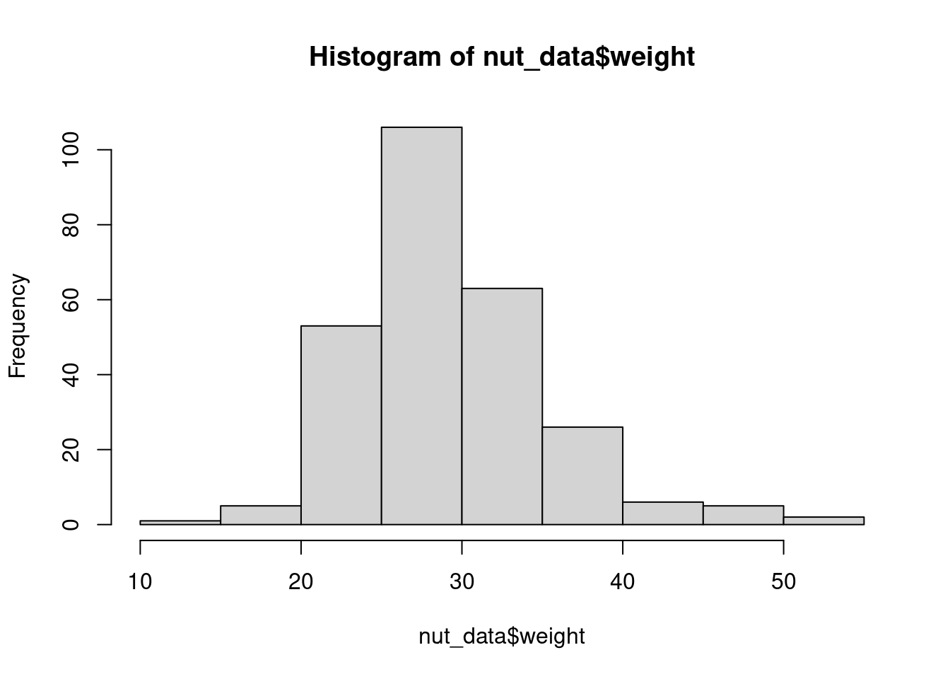
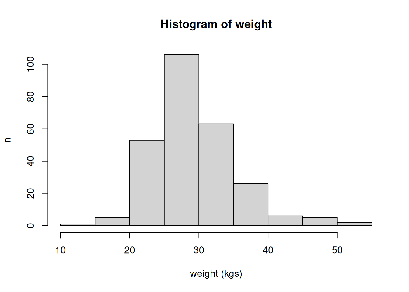
A histogram of the weight variable can be created as follows:
### Histogram of weight of all children ----hist(nut_data$weight)
Figure 1: Histogram of weight of all children
By default, the hist() function already creates a title and x and y axis labels to the histogram.
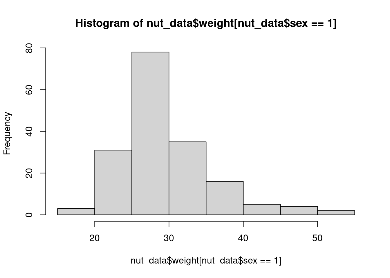
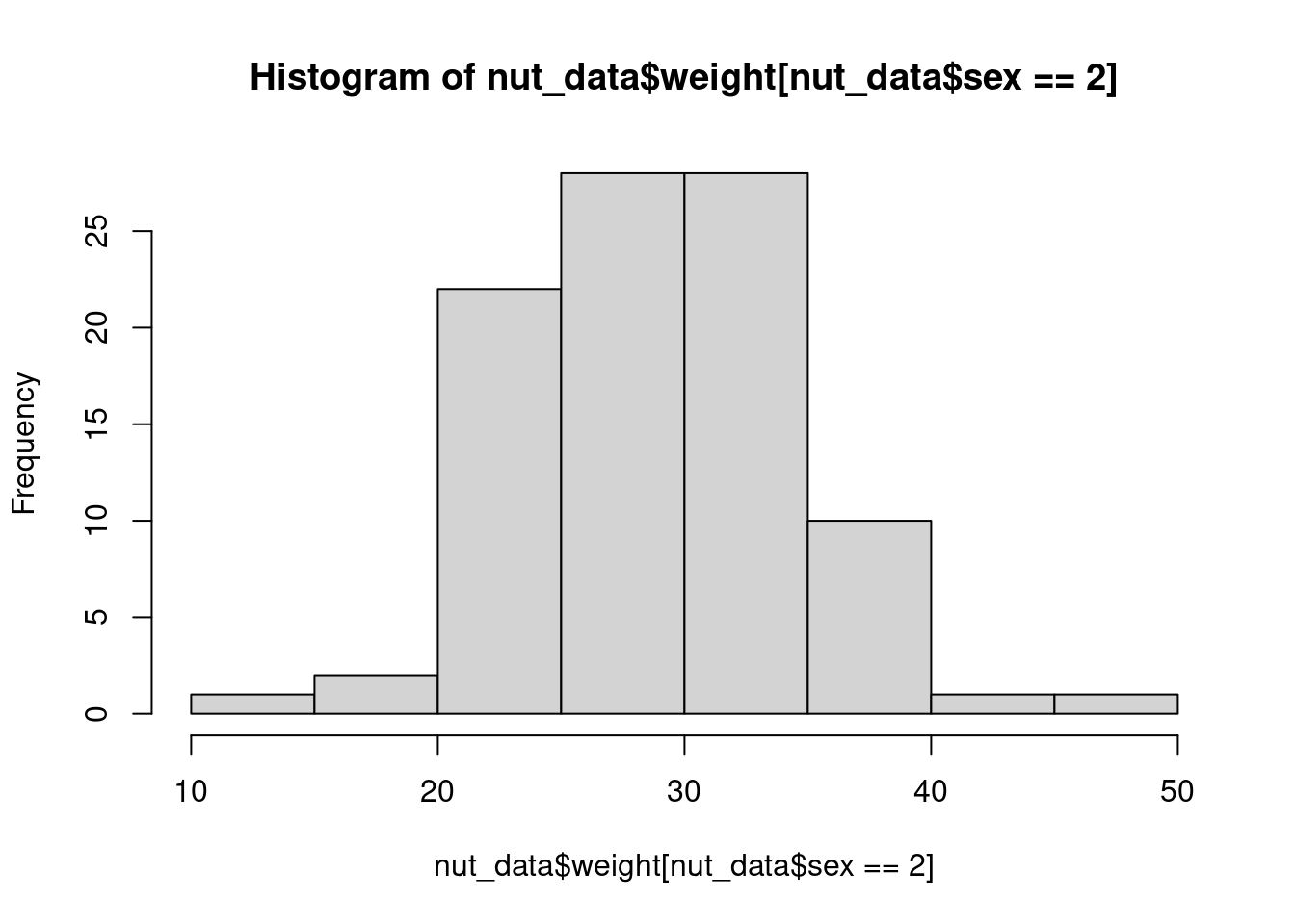
We might be interested in comparing the distribution of the weight variable between male and female in the dataset. We can create two histograms for weight. One for the males in the dataset and one for the females in the dataset.
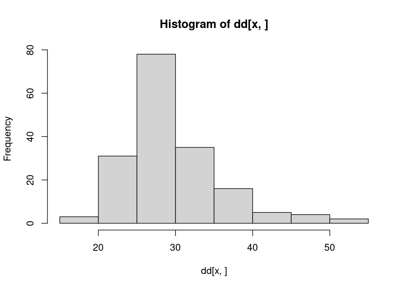
### Histogram of weight of male children ----hist(nut_data$weight[nut_data$sex ==1])
Figure 2: Histogram of weight for male children
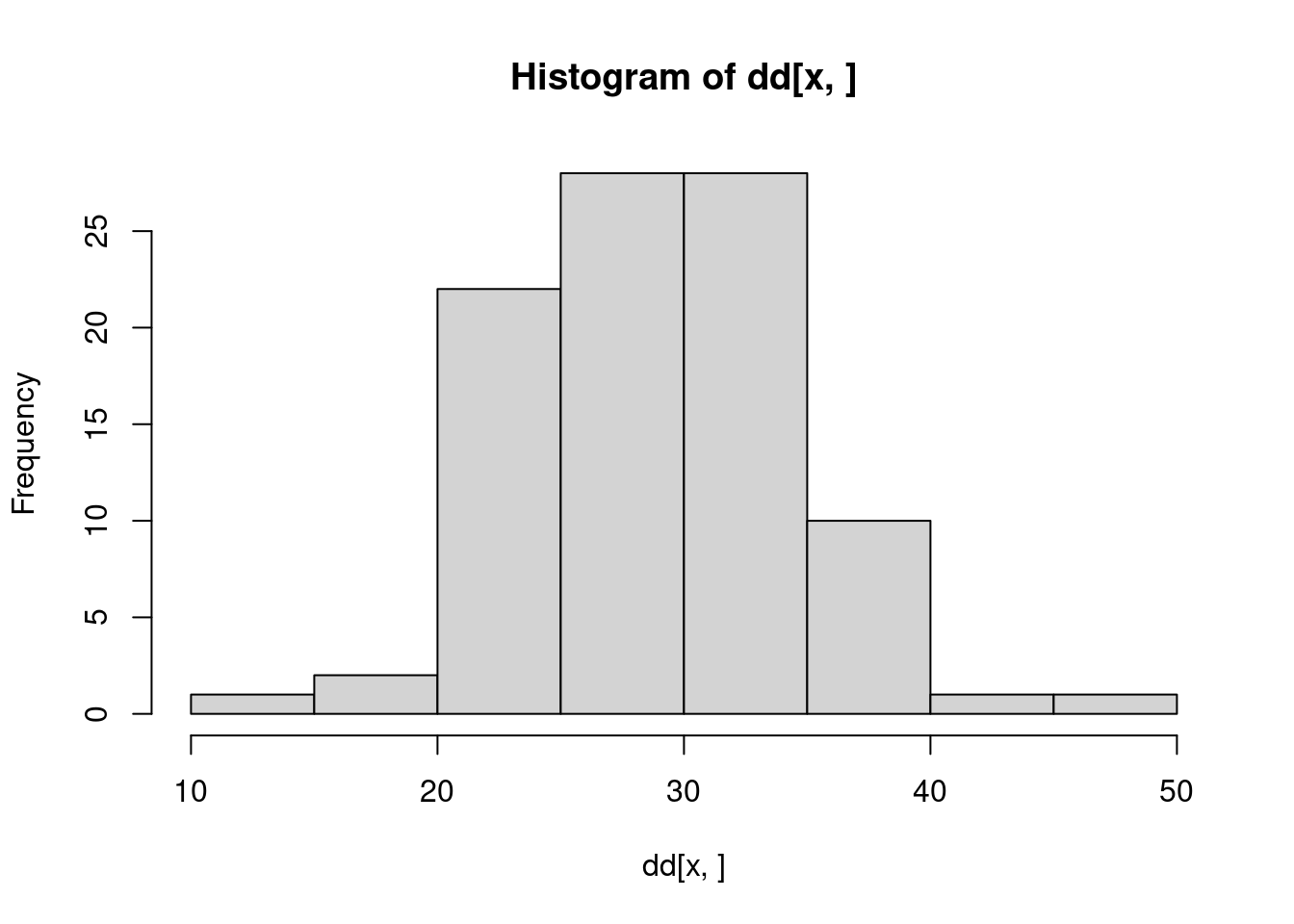
### Histogram of weight of female children ----hist(nut_data$weight[nut_data$sex ==2])
Figure 3: Histogram of weight for female children
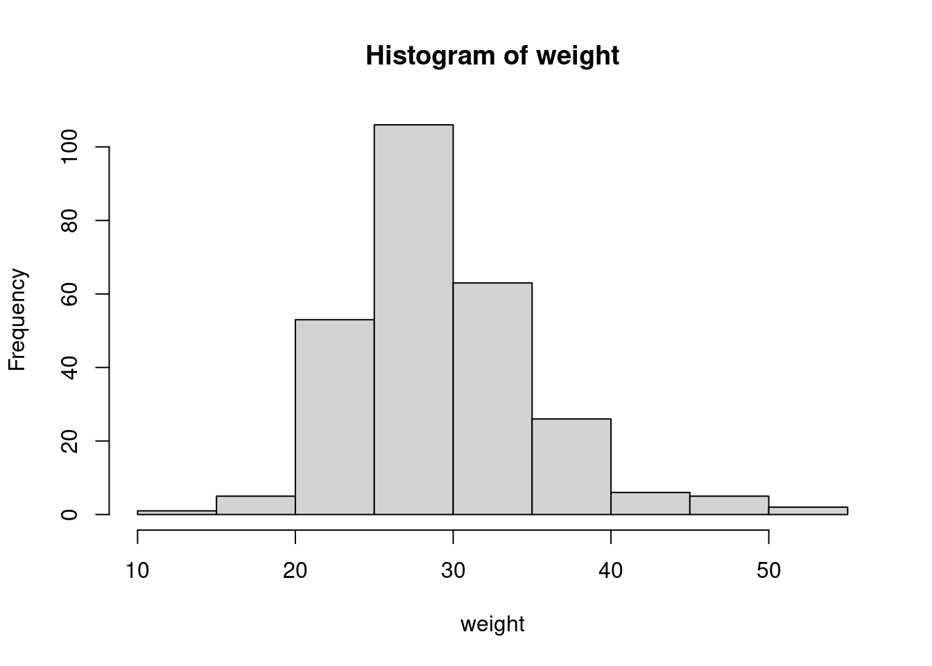
We can simplify the above code by using the with() and by() functions. We can plot the weights of all the children using this:
## Use with to plot weight for all children ----with(nut_data, hist(weight))
Figure 4: Histogram of weight for all children using with
We notice that using with(), the default title used is tidier as is the x and y axis labels.
We can use with() and by() to plot the histogram of weight values for males and females as follows:
## Use with to plot weight for male children ----with(nut_data, by(weight, sex, hist))
This gives us two plots, one for males first and then the second for females, with just one line of code. However, we notice also that this produces a side-effect output which is a list of class “histogram” with values for breaks, counts, density, mids, xname, and equidist. This is good to note as this indicates to us that other than the histogram plot output that is visibly produced, there is an invisibly produced output of values that can be used for further analytical purposes laster on.
Styling a histogram
The above plots for histograms of weight for all children and weight for male and female children are a good start. But, for them to be usable in a report or a publication, we need to add some appropriate styling.
Labels
As noted above, the plot created using the with() function is already labeled appropriately (title, x and y axis labels). However, if we wanted to further customise the labels, we can do this as follows:
## Customise labels of histogram ----with( nut_data,hist( weight, 1main ="Histogram of weight",2xlab ="weight (kgs)",3ylab ="n" ))
1
main is the argument to set the plot title
2
xlab is the argument to set the x-axis label
3
ylab si the argument to set the y-axis label
The hist() function allows for specifying graphical parameters arguments such as main, xlab, and ylab used for labeling plots to produce this histogram:
Figure 7: Histogram of weight with customised labels
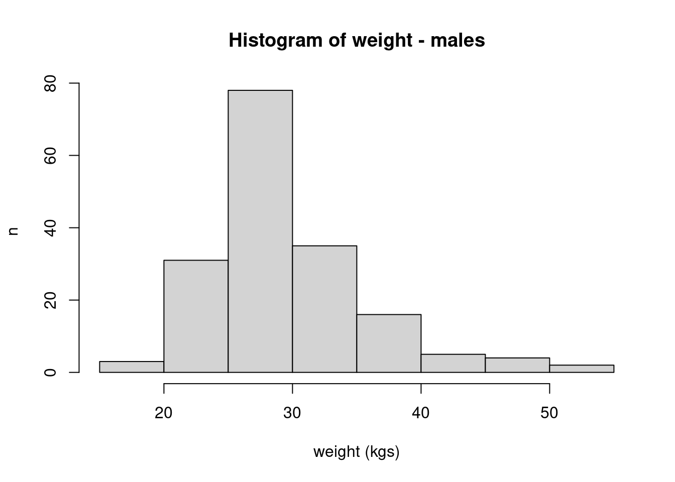
For the histograms of weight of male and female children, we first produce histograms for male and female children and store the list output into an object whilst the plot output is suppressed.
## Customise labels of histogram ----### Create plot for each sex and assign to object ----1hist_sex <-with( nut_data, 2by(weight, sex, FUN = hist, plot =FALSE))
1
We use the side effect output of hist function and assign it to hist_sex so we can use it in the next steps for plotting.
2
Set plot = FALSE so that only side effect output is produced.
Then, we plot the histograms for males and females separately by accessing the values that can create these plots from the object hist_sex.
### Plot histogram for male children ----plot(1 hist_sex[[1]],main ="Histogram of weight - males",xlab ="weight (kgs)",ylab ="n")
1
Access the first set of values from hist_sex using indexing of a list to plot the histogram for male children
Figure 8: Histogram of weight for male children with customised labels
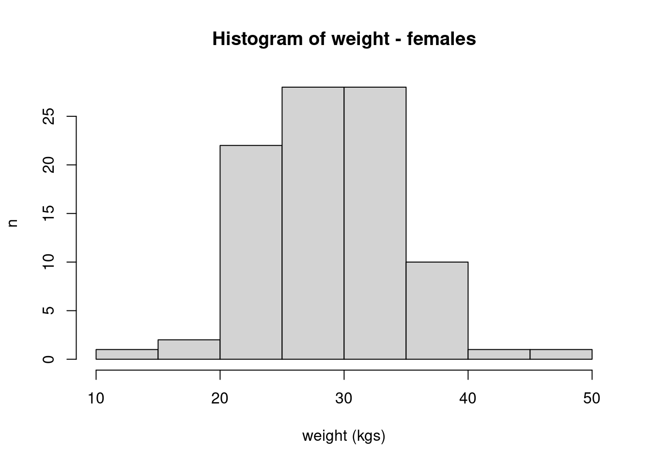
### Plot histogram for female children ----plot(2 hist_sex[[2]],main ="Histogram of weight - females",xlab ="weight (kgs)",ylab ="n")
2
Access the second set of values from hist_sex using indexing of a list to plot the histogram for female children
Figure 9: Histogram of weight for female children with customised labels
Layout
The layout of the plot for all children looks quite good already so we don’t do anything else with regard to layout.
For the histogram for weight of male and female children, the two plots get produced one after the other in separate plots. So, if we want to compare them, it is a bit difficult because we don’t see them side-by-side or in the same plot one on top of the other. Tt would be good if we can find a layout that will allow us to make comparisons between the two.
Layered
We can try a layered layout in that one plot is on top of the other plot to aid comparison.
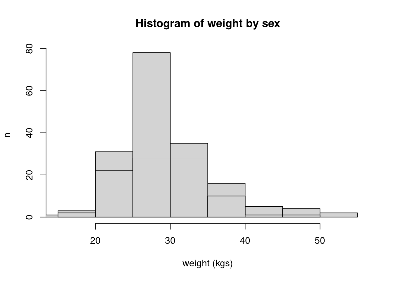
### Plot female weight histogram on top of male weight histogram ----plot( hist_sex[[1]],main ="Histogram of weight by sex",xlab ="weight (kgs)",ylab ="n")plot( hist_sex[[2]], 1add =TRUE)
1
This adds the the second plot (for females) as a layer on top of the first plot (for males)
Figure 10: Histogram of weight by sex with layered layout
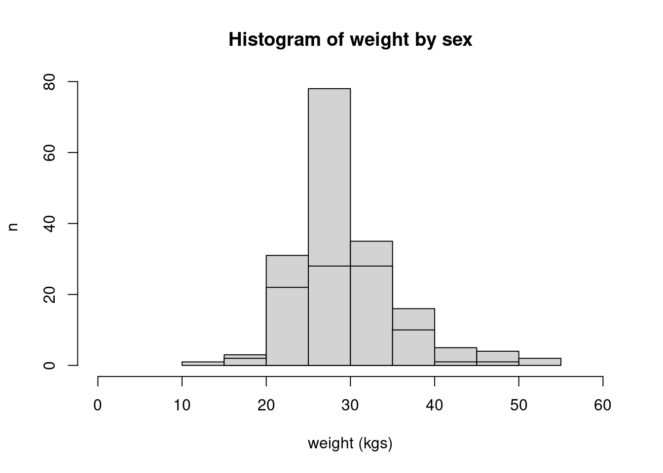
The resulting plot is still not quite right. On the x-axis, it seems one of the plots has the lower bins cut off. We can make the following improvements to see the full spread of values on the x-axis:
### Plot female weight histogram on top of male weight histogram ----plot( hist_sex[[1]],1xlim =c(0, 60),main ="Histogram of weight by sex",xlab ="weight (kgs)",ylab ="n")plot( hist_sex[[2]], add =TRUE)
1
Specifying the limits of the x-axis will allow the lowest values and highest values for both male and female weights to be show on the joint plot.
Figure 11: Histogram of weight by sex with layered layout
The resulting plot is still not quite right. The plot is not clear in differentiating the plot for males and females. Use of colour might work here (see Section 3.3).
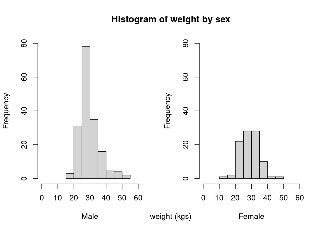
Side-by-side
We can try a side-by-side layout to aid comparison.
## Plot male and female weight histogram side-by-side ----### Setup plotting window ----1par(mfcol =c(1, 2))### Plot male weight histogram ----plot( hist_sex[[1]],xlim =c(0, 60),ylim =c(0, 80),main =NULL,xlab ="Male",)### Plot female weight histogram ----plot( hist_sex[[2]],xlim =c(0, 60),ylim =c(0, 80),main =NULL,xlab ="Female")### Return plotting window to original ----2par(mfcol =c(1, 1))### Add title ----title(main ="Histogram of weight by sex", xlab ="weight (kgs)")
1
This changes the default graphical window to 1 row and 2 columns.
2
Return graphical window to original.
Figure 12: Histogram of weight by sex with side-by-side layout
Colour
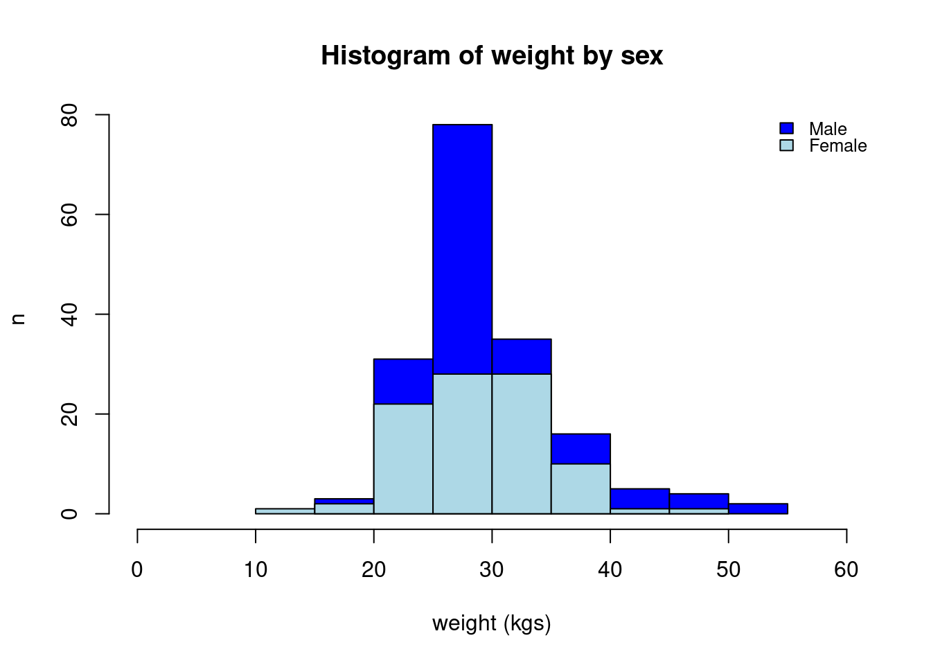
We can utilise colour to distinguish two histograms that we are comparing. Using the example above of the layered histogram, we can distinguish the male and female weight histogram by using colour as follows:
### Plot female weight histogram on top of male weight histogram ----plot( hist_sex[[1]],col ="blue",xlim =c(0, 60),main ="Histogram of weight by sex",xlab ="weight (kgs)",ylab ="n")plot( hist_sex[[2]],col ="lightblue",add =TRUE)1legend(x ="topright", legend =c("Male", "Female"),fill =c("blue", "lightblue"),bty ="n", cex =0.8,y.intersp =0.8)
1
This is how you add a basic legend.
Figure 13: Histogram of weight by sex with layered layout using colour